Portfolio Review
Reviewing VENUS

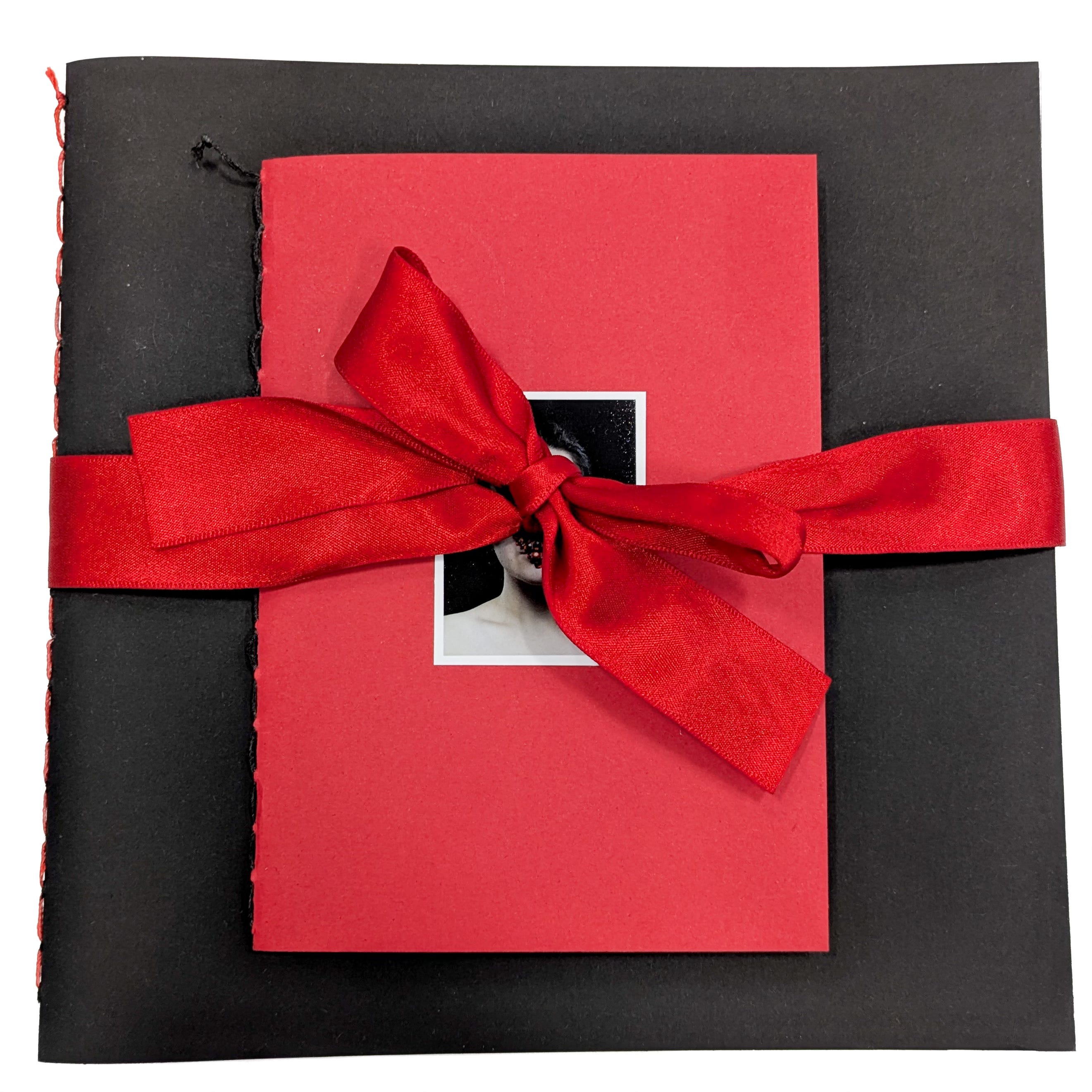
In university, we participated in a portfolio review with Alumni and external photographers where we could showcase and discussion our final major projects. For this specific review, I took over my draft version of my book VENUS.
I was curious as to how the concept of my work came across to viewers who hadn’t witnessed the project previously and how the two books came across. VENUS is comprised of two books, a photobook containing the photos from VENUS and the other book a small poetry anthology to accompany the main work.


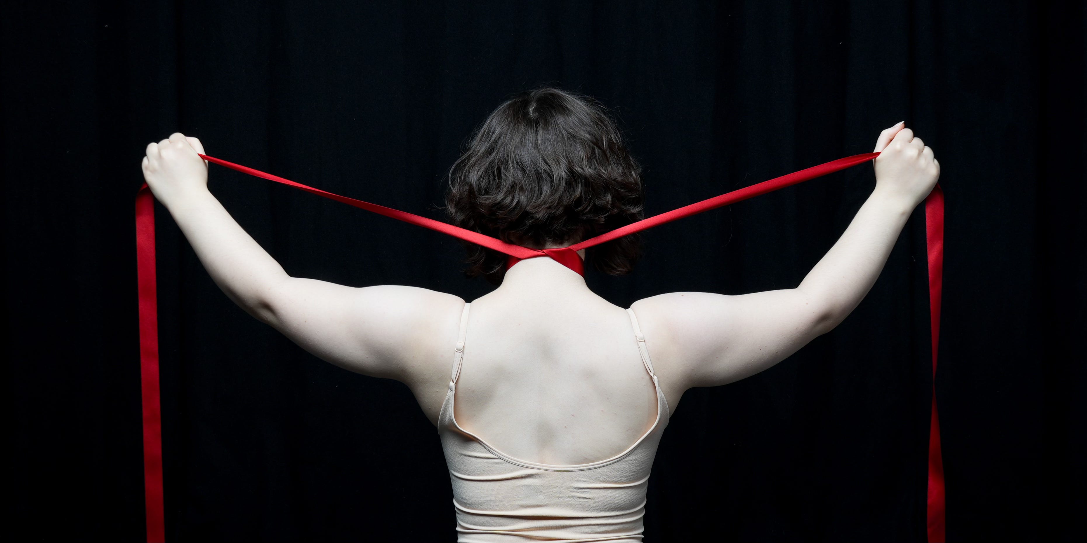
For my portfolio reviews, I got to show my work to two practitioners, Roz Doherty and Thomas Duffield. I spoke to Roz first and gained useful insight on my book. Roz felt that the concept of the work came across and we talked specifically about the use of ribbon. Throughout the project, I have utilised red ribbon as a way to represent being bound. She felt the idea came across as there were photos with the ribbon that to her resembled strangulation and being bound to someone. Additionally, I had presented the book by wrapping a ribbon around it, which she felt suited the work.
Roz recommended I consider where my work stands within the wider scale of work on my subject matter. When creating work on more taboo subjects, it is important to consider where it stands within work that has already been done and additionally how it will come across to a wider audience. She suggested I research Sujata Setia’s project A Thousand Cuts, where the artist cuts into her prints to represent the stories of survivors of domestic abuse. I found this particular work engaging as it explores using physical manipulation to portray violence. Underneath each cut is red, which is also similar to my own use of red in my project.


Next, I spoke to Thomas Duffield, who held similar sentiment about how the work came across. It was reassuring to know that my message came through in the work, both with and without the poetry. We talked more specifically about the use of tracing paper in the book. As a way to add layers and have the viewer delve into the work, I added a few pages into my book where a photo on tracing paper is placed on top of a different photo on normal paper. Thomas felt as though this was effective, and we discussed if this could be used more within the book. For example, he mentioned turning the end pages of the book into tracing paper so that the text at the start and end would be visible, which I felt would be really effective. The ones he also felt worked the best were the sequences in which a normal contortion photo was placed on top of a red one, so that the colour shone through and created weird shapes within the body.


Finally, one of the things which I discussed with both practitioners was the use of text. Both agreed that keeping the poetry separate from the photos helped keep the project more open so that viewers can process the work how they feel is best. The photos are able to stand alone and portray the concept, but the poetry is also an aid to give extra context for any viewers that are interested in further delving into the project. I have kept one poem, titled VENUS, in the main photobook as it directly relates to the photos. Both practitioners suggest that this poem go at the end of the text to finish, which I agreed with.


Another suggestion which Thomas Duffield made was to have a back pocket for the poetry book. Having the poetry book on top took away from the main photobook, so having it in a pocket at the end helped keep the books together and keep the main focus on the photobook. Overall, the portfolio review sessions were very insightful and both practitioners helped me consider how to go forward in the book making process. Details on my book VENUS will be explored in an upcoming post.
Thank you to Roz Doherty and Thomas Duffield for providing their assistance and wisdom and thank you to our university staff for putting on the review day!

